PowerBIAccessibility
Power BI Accessibility Best Practices
Table of Contents
Introduction
What is this document?
This document is a guide to the best practices for creating accessible data visualizations and data reporting, specifically for Microsoft Power BI. This includes WCAG requirements and suggestions for how to best create a report to be accessible, as well as steps on how to fix these issues within Power BI. There are two sections directly related to our chrome extension - PowBility:
- PowBility Tests - More Information: this is directly linked to from the specific tests run through PowBility and contains more information on each test currently included in the extension
- PowBility Manual Tests: this is information on tests that cannot be automatically run through an extension, but are suggested for PowBility users to read in order to create more accessible Power BI reports
There is also a section called Best Practices which summarizes all the information we have found on creating accessible Power BI reports and visualizations. Finally, there is a Resources section which includes links to all of the sources we have referenced in this document and more.
Errors Vs. Warnings
For this checker, we use two categories to define accessibility issues: errors and warnings. Errors represent issues that explicitly go against WCAG requirements whereas warnings signify a deviation from the suggested best practices for accessibility defined within this document.
Error
A violation of WCAG requirements such as not including titles on your visualizations. While our checker does not include tests for every single WCAG requirement, all of the rules are included at this link1.
Warning
A warning is defined as something that does not match with the best practices for creating accessible Power BI reports as highlighted in this document. Examples of violations of these best practices are using stacked charts instead of clustered charts, not using unique markers for series, and charts not using category or data labels. These best practices have been chosen based on research referenced within this document. While not every best practice is best for every graph, these suggestions were chosen in order to be applicable in most situations.
Overview of Accessibility
Accessibility is about enabling people to achieve their goals and creating better experiences for everyone. In particular, accessibility focuses on creating tools that can be utilized to their full potential by anyone, including differently-abled people. Technologies should be made to not only serve those who are able-bodied, but also those who have disabilities in order to create diversity of thinking and add perspectives, thereby leading to innovation and growth.
Accessibility for Data Visualization
Within WCAG itself, there is a distinct lack of accessibility guidelines for graphs and visualizations11, such as the ones within Power BI reports. This is a large oversight since a large portion of web based content utilizes graphical representations of data and information. The other issue with creating accessible visualizations is that there are no solid agreed upon rules to make them accessible. One change that might help a color blind user may hinder a user with a cognitive disability. Due to this, it is particularly difficult to come up with a “one size fits all” approach to creating a guide to accessible visualizations. Hence why this document focuses on making suggestions that are the best in most situations, but still require the user to use their best judgement when deciding who is most likely to be viewing the report and which accessibility issues are the top priority.
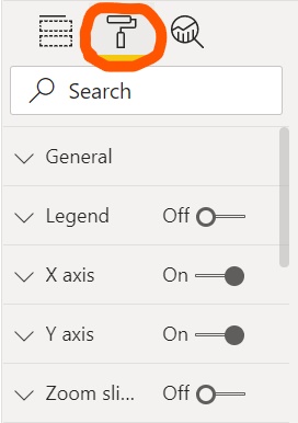
Power BI Settings Options
Data labels and gridlines both improve the readability of visualizations. However, each of these must be used with common sense in mind since too many data labels or gridlines can have the opposite effect and decrease readability. It is also recommended to use one or the other, but not both at the same time since that can lead to added confusion.
Data Labels
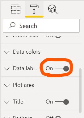
One feature that Power BI offers is turning on category and data labels. This can help users better differentiate the values and categories of the data being shown. It is typically best practice to put the labels inside of the chart, although this also depends on spacing and coloring.
How to Enable Data Labels:
- Select the format pane
- Scroll down to where it says data labels and select the dropdown
- Toggle data labels to the “on” position
- Toggle customize labels to the “on” position
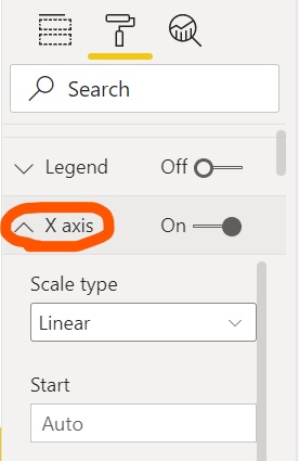
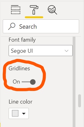
Gridlines
Another feature that Power BI offers that can increase readability is turning on gridlines.This can help readers track and read the information easier. It is important to make sure that the color of the gridlines is easily visible against the background color of the visualization and that the right amount of gridlines are used. Too many gridlines can make the visual too busy to look at and too little won’t provide the necessary information. In general, it is typically best to sort gridlines by value, time/numerical sequences, and categorical sequences.
How to Enable Gridlines:
- Select the format pane
- Select the X-axis dropdown
- Toggle gridlines to the “on” position
PowBility Tests - More Information
Errors
Charts Must Have Descriptive Titles
What is the issue?
Your chart may either not have a title, or the title itself may need to be changed in order to increase clarity for your users.
Why is it an issue?
Titles are important for multiple reasons. One is that people who use screen readers will hear the title and type of visualization (as well as the descriptive alt text) as a preview of the visualization2a. This information is what they use when deciding whether or not to “enter” the visualization or skip over it. Titles are also important to help people with cognitive disabilities understand what they are looking at7. Even if you do not have a disability, clear titles are an important way to orient your users and direct them to what information they should get out of your visualization.
How can I fix it?
First you need to decide on what your title should be. Titles shouldn’t use jargon or acronyms where avoidable2d. They should also clearly define the purpose of your visualization, and possibly what the major takeaway is4. The insights you want your audience to get from your visualization should be included in the alt text and possibly a summary of your chart below it. When it comes to designing for accessibility, the most important thing is to have all the information you want your user to understand available in multiple ways. This means graphically, through text, audio, tooltips, alt text, and more. In this case, the title is an important textual element to increase understanding, so make sure it is as clear as possible.
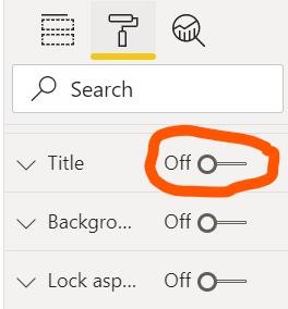
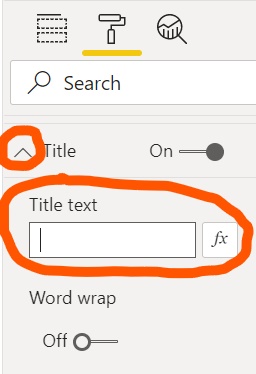
The second step is to actually add the title in Power BI. In order to do this, you will need to:
- Select the visualization and go into the ‘Visualizations’ panel.
- Select the paint roller icon which is the ‘Format’ section of the panel and scroll down to where it says ‘Title’.
- If it says ‘Off’ next to ‘Title’, click the switch to turn it on.
- Click on the downward arrow to open the menu, and then enter your text in the textbox below ‘Title text’.
Warnings
Charts With Multiple Series Should Use Unique Markers Per Series
What is the issue?
If you have a line or area chart, you may have multiple series, meaning lines that are included in the chart. For example, you may have an area chart displaying ‘This Year Sales’ and ‘Last Year Sales’ like the chart shown below:
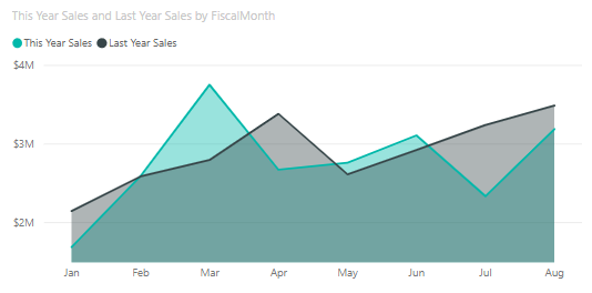
Currently, all you see are the lines showing each year’s sales over the months. However, you can add markers to the chart to show each individual data point, as shown below:
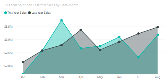
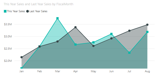
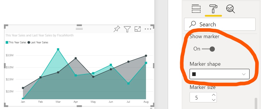
Now there are markers on each series, but they are all circles. The shapes for the different years should also be different, for example a circle and a square:
Why is it an issue?
If there are no markers used, or the markers are not all unique per series, the only way to differentiate between them is the colors in the legend. This is obviously a problem for people who are colorblind. It is actually a WCAG requirement that “color is not used as the only visual means of conveying information”1a. This is also recommended in the Power BI documentation2a.
How can I fix it?
There are a few steps needed in order to turn on markers and change them to be unique:
- Select your chart, open the ‘Visualizations’ panel, and select the paint roller icon which is the ‘Format’ section of the panel.
- Scroll down to where it says “Shapes” and click the down arrow to open it.
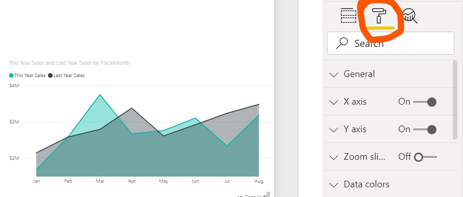
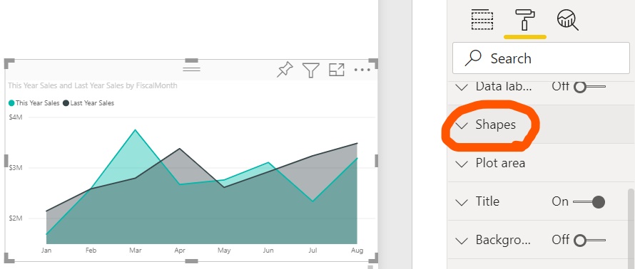
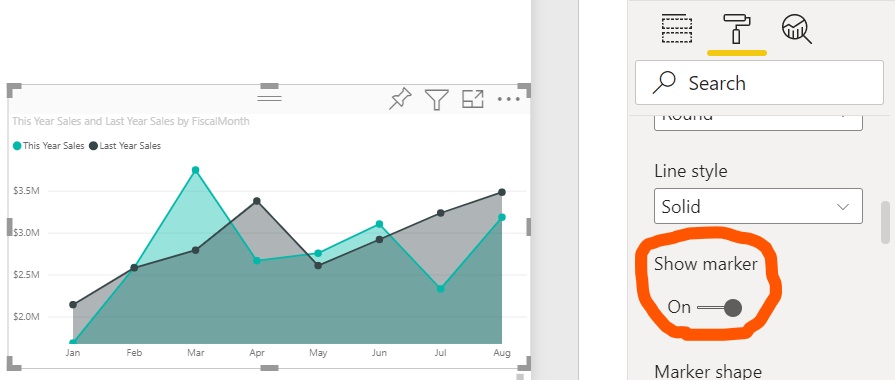
- Scroll down that menu to where it says ‘Show marker’ and make sure that is turned on.
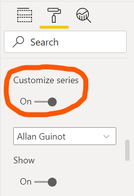
- In order to make the marker for each series unique, continue scrolling down the ‘Shapes’ menu until you get to where it says ‘Customize series’ and make sure that is also turned on.
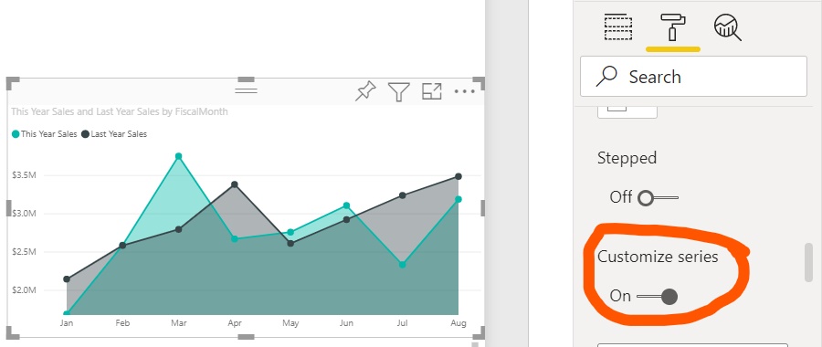
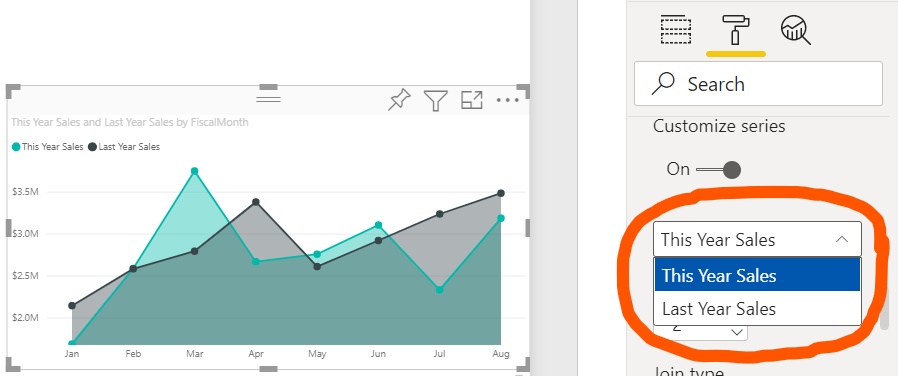
- This is where the fun part starts. This section allows you to select each series and customize the markers for it. Right below the ‘Customize series’ button is a dropdown menu of all the series you have in your visualization. You can then select the series you want to change out of that dropdown menu.
- From there you can scroll down to ‘Show marker’, make sure that is turned on, and select the marker shape you want for that particular series. There are also additional options, like changing the size of the markers.
Charts Should (Generally) Not Use Stacked Option
What is the issue?
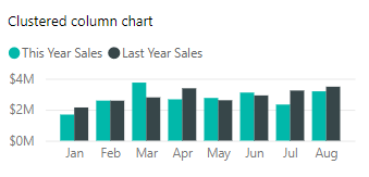
Stacked charts are frequently misused, and it is possible that you are using a stacked chart when instead you should be using a clustered one. The difference between the types of charts is shown below:
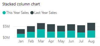
Stacked charts should be used to “compare total values across several categories”10b. Basically, if you ignore the series, the total numbers for each bar or column should still have meaning. For example, if you are looking at the total sales for each month and splitting them up by the category of sale.
Why is it an issue?
When a stacked chart is misused, it makes it much harder to compare the magnitude of the difference between series. For example, in the stacked column chart above, it is difficult to tell if the total sales from June was higher or lower this year as compared to last year. In the clustered column chart, we can see that it was lower. We can also see that the sales in March this year were about 75% of the sales in March last year. Visualizations are all about making it easier for the user to understand your data and the insights you want them to get out of it. When you are making it more difficult for your user, you are making your visualization less accessible, especially for people with cognitive disabilities who need the visualization to be as clear as possible.
How can I fix it?
First, you need to decide if it really is an issue. This article10b gives a great overview of when to use stacked or clustered charts. If you have decided to change to a clustered chart, you can reference the suggested chart given by the PowBility accessibility checker, or reference the table below.
| Stacked | Clustered |
|---|---|
| Stacked Bar Chart | Clustered Bar Chart |
| Stacked Column Chart | Clustered Column Chart |
| 100% Stacked Bar Chart | Clustered Bar Chart |
| 100% Stacked Column Chart | Clustered Column Chart |
| Line and Stacked Column Chart | Line and Clustered Column Chart |
| Stacked Area Chart | Area Chart |
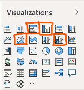
Once you know what type of chart you want to use, open the ‘Visualizations’ panel and select the chart you want to change. Then simply click on the chart type you want. Hover over a chart icon to see the name of the type of chart. The stacked chart options are circled in the image below:
Charts Should (Generally) Use Category Labels
What is the issue?
This test is specifically run on funnel charts, pie charts, donut charts, and treemaps. This is because all of these charts have the option to turn on category labels which should, generally, be done. For funnel charts and treemaps this issue will be triggered when category labels are not turned on. For pie charts and donut charts this issue will be triggered when no labels are used, but will not be triggered if some labels are used even if this does not include the category.
Why is it an issue?
Category labels, as well as data labels, are a way to directly connect the information to the spot on the visualization that represents it. Without these labels, you may be relying on a legend which means that the information is only displayed through color which is inaccessible for colorblind or visually imparied users. With funnel charts in particular, there is no legend and category labels equate to a labeled categorical axis which is necessary to have an understanding of what the data represents. Labeling data directly also reduces the cognitive load for your users6.
How can I fix it?
There are slightly different steps depending on the type of chart you are using, however the first step is the same. Select your chart, open the ‘Visualizations’ panel, and select the paint roller icon which is the ‘Format’ section of the panel.
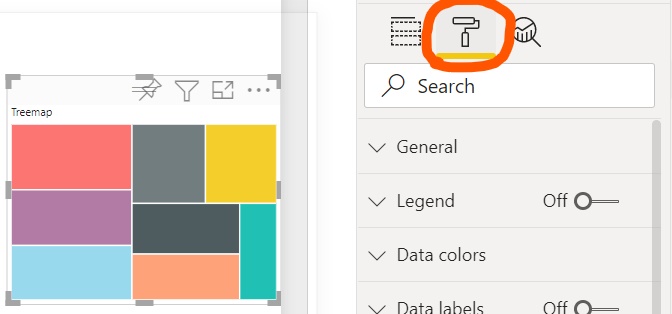
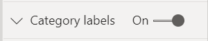
If you are using a funnel chart or treemap, scroll down to where it says ‘Category labels’ and turn them on.
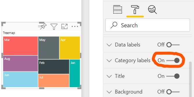
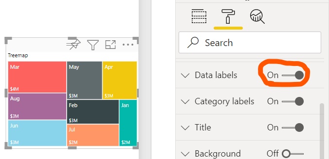
If you are using a treemap, you may want to also scroll to where it says ‘Data labels’ and turn those on as well. This will show the numerical value associated with each section in the treemap.
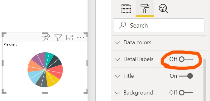
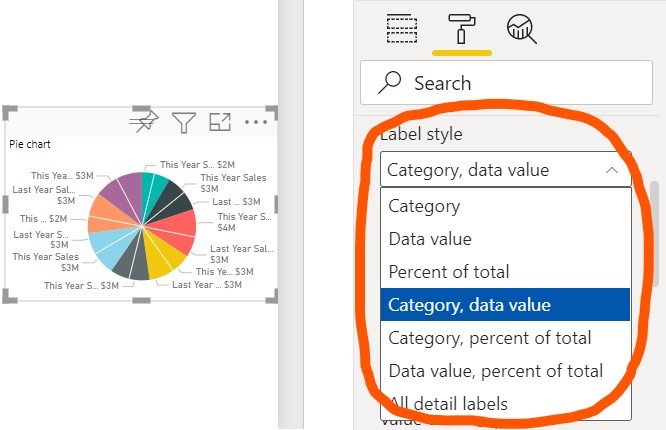
If you are using a pie chart or donut chart, scroll down to where it says ‘Detail labels’ and turn that on. From there, you can choose your ‘Label style’ which just indicates which type of data is included in the label. You should generally include the ‘Category’ and the ‘Data value’, however this might make the visualization too crowded and hard to read. If this is the case, you may want to use another type of chart.
PowBility Manual Tests
Errors
Tab Order Must Make Sense
What is the issue?
In Power BI, you can decide the order in which people consume a report when they are using an accessibility tool through the tab order. This order should be the same order you expect your user to visually consume the report in2b. For example:
- Title
- Visualization One
- Visualization One summary
- Visualization Two
- Visualization Two summary
- Conclusion
Why is it an issue?
When a user of your report is using a screen reader, the tab order will be the same order that the screen reader reads out your report to them. Similarly, if a user has a motor impairment and cannot use a mouse, they may use the tab key to navigate through your report in order to select elements and interact with them. Because of this, it is a WCAG requirement1b that this order is meaningful in order to reduce confusion that would result from an illogical order.
How can I fix it?
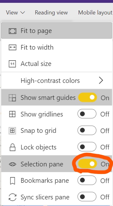
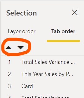
To view the current tab order:
- Go to ‘View’ and turn on the ‘Selection’ pane.
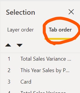
- Click on ‘Tab Order’.
- Either drag elements up and down to change the order, or select an element and use the arrows to move them up or down.
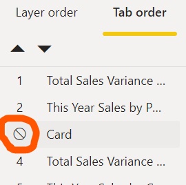
- If there are any decorative elements that should not be included in the tab order, hover over the number next to the element to see the remove icon and then click the icon to hide it from the tab order.
Alt Text Must be Descriptive
What is the issue?
Alt text is an important way to enhance a user’s understanding of any non-decorative image or visualization when they are using a screen reader, however just the existence of alt text is not enough. The text should be descriptive enough to help a user decide whether or not to “enter” the visualization or skip over it. Even if they do skip over it, the description should also be enough to supplement looking at the visualization.
Why is it an issue?
For people who are visually impared and using screen readers, text is (generally) the only form of access they have to anything online. Screen readers will read any of the text directly on the page as well as any alt text connected to an element. This makes alt text the main way to make a page accessible to visually impaired users. This is especially important for visualizations, because visualizations are difficult to understand just by hearing the data points used. Visualizations are meant to enhance a user’s understanding of the data and encourage specific insights in their viewers. Bad alt text can mean that a user who is unable to view the visualization will not get that same information.
How can I fix it?
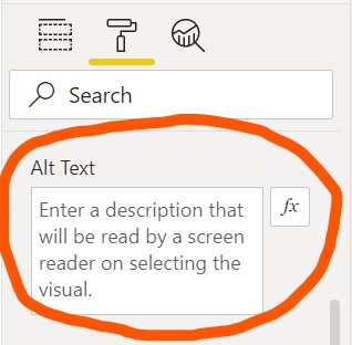
Most alt text is already handled by Power BI, and even visualizations will have the title and type of chart automatically included in it’s alt text2c. The alt text you need to add is in addition to this which has a limit of 250 characters. This alt text should be a supplement to the title if you are including a text summary along with the visualization, or be a summary of the major insights you want your user to get. In order to add alt text:
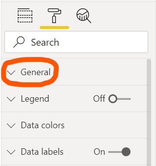
- Select your chart, open the ‘Visualizations’ panel, and select the paint roller icon which is the ‘Format’ section of the panel.
- Click on the downward arrow next to where it says ‘General’ to open the menu.
- Scroll down to where it says ‘Alt Text’ and type your description in the text box. If you would like to write a dynamic description that is based on the data and will be updated if the data changed, click on the ‘fx’ button.
Best Practices
Color
- Ensure color contrast between text elements and their background are at least 4.5:12d, 9
- Ensure color contrast between (interactive) non-decorative non-text elements and their background is at least 3:1. (text size changes rule) (need to consider all states, e.g. hover/focus changes)2d
- Avoid using color as the only means of conveying information; use text or icons to supplement or replace the color2d, 3, 8
- Check that your report page works for users with color vision deficiency2d, 3, 6, 8
- Check the visual using high contrast mode to ensure the colors change appropriately; if the appearance is not high contrast, look for another visual2d
Text
- Replace unnecessary jargon or acronyms and use clear language2d, 3, 8
- Add descriptive, purposeful titles to charts2d, 4, 6
- Add explanatory text as needed to describe your charts and their necessary context (perhaps via textbox or visual header tooltips)2d, 3, 4
Alt Text
- Ensure alt text is added to all non-decorative visuals on the page2d, 4, 6, 9
- Make sure to put text contents of a textbox in the alt text box so screen readers can read them; if the text doesn’t fit within the alt text character limit, write a summary or highlight an important data point2d
- When using images to call out data points, use alt text to explain what is being called out2d
Video/Audio
- Avoid video that automatically starts when the page is rendered2d
- Ensure your video has captions or provide a transcript2d
- Avoid audio that automatically starts when the page is rendered2d
- Provide a transcript for any audio2d
Other
- Check the accessible Show Data table for custom visuals. If the information shown is not sufficient, look for another visual2d
- Set tab order and turn off tab order (mark the item as hidden) on any decorative items2d, 8
- Purposefully set the sort order of each visual on the page; the accessible Show Data table shows the data in the sort order you have set on the visual2d
- Avoid using too many decorative shapes to the point where they are distracting2d
- Is key information only accessible through an interaction? If so, rearrange your visuals so they are pre-filtered to make the important conclusion more obvious2d, 3, 4
- Do add default tooltips to charts as ancillary information; it is included in the accessible Show Data table for each visual2d
- If using the Play Axis custom visual, ensure it does not autoplay; make it obvious that the user must press the play/pause button to start/stop the changing values2d
- Add redundant representations for critical messages5
- Label data directly4, 6
- Use white space4, 6
- Use dropdown menus over sliders4
Resources
- Web Content Accessibility Guidelines (WCAG)
- Power BI Documentation
- An intro to designing accessible data visualizations
- A Comprehensive Guide to Accessible Data Visualization
- Why Accessibility Is at the Heart of Data Visualization
- accessible data viz is better data viz
- Dos and don’ts on designing for accessibility
- 7 things you can do to make your Power BI dashboards more accessibly compliant
- Top 8 Most Common Accessibility Issues to Avoid and Solve
- Stacked Bar Charts
- Data Visualization Accessibility: Where Are We Now, and What’s Next?